

Be the cool kid at congress....
Posters are an excellent opportunity to showcase your work, stimulate feedback and build your research network. But most contain too much text.
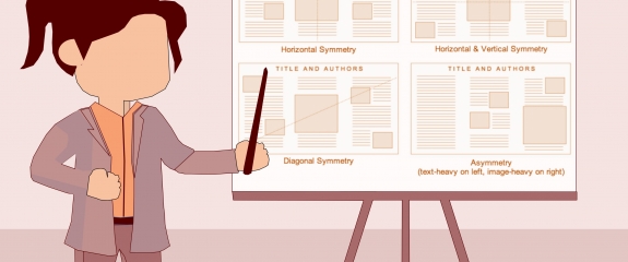
If you follow the link here you will find our guide on how to best display your research. We advise you to use plain language, keep strings of text to a minimum (<50 words) and employ bullets to emphasise points. To engage your audience be bold and explicit, making the strongest statements your data will support. Make it easy for conference attendees to contact you after the meeting. Have your contact details clearly displayed on your poster and handouts - and don't forget the obvious - stand by your poster and encourage visitors to talk with you about your research.
We offer some insights from the Niche medical writing team, who have been producing research posters for the pharmaceutical industry and academia since 1998. Anyone can read the many guidelines on what makes a great poster, but can they produce something that looks professional and clearly communicates your message? Our guide also points you to useful online and our free poster templates (portrait and landscape) as well as our poster design selector.
Finally, did you miss this month's Insider's Insight on clinical site selection? You can download it here.